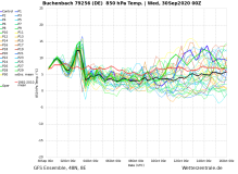
The upper set of the lines are the predicted temperatures (left-hand axis), in Geneva, by the various runs, and the lower set of lines are the predicted amount of precipitation (right-hand axis - rain in mm/snow in cm).
The bold white line in each set is the average predicted by all the runs.
This graphic is produced by and is the property of the frankly awesome WetterZentrale site - who provide a fantastic array of information for the technically-minded (in German).